Exasperated wife to her guitar-junkie husband: “How many guitars do you really need?” Husband: “Just one more.” And so it goes with woodwind doublers as well. Ask my wife. She knows.
Flutes illustrate an aspect of economics each of us faces every day. One can buy a starter flute made in China for as little as $500. It won’t get you very far, but it will play. When one steps up to $1,000, one can get a much better instrument. A move up to $4,000 or so brings in many qualities including better intonation (in tune), special keys such as a high-C# trill key, and a more playable head joint.
The type of flute one might play in a major symphony orchestra starts at around $12,000 or so. These would be solid silver flutes with hand-voiced tone holes to help the instrument have an even timbre throughout its range. Many top players prefer gold, which puts the flute up over $20,000. Add a platinum head joint with gold keys and you reach the pinnacle of performance at around $50,000.
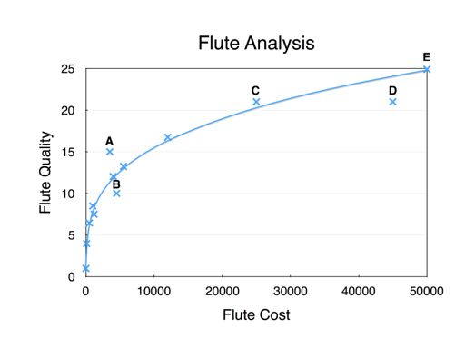
The chart below illustrates some important points:

In this graph, I plotted some hypothetical flutes with cost versus quality. Quality in a flute consists of things such as evenness of tone, how in tune it plays, how easily it plays, how it sounds, and how well it stays in adjustment.
Note the shape of the “curve.” As we increase the amount we are willing to spend, we get more and more quality. However, as the cost rises above $10,000 or so, the rate of increase in quality starts to go down. We pay more and more for small incremental improvements. This illustrates the “law of diminishing returns.” This law confronts us when we buy a car, clothes, food, and almost anything else. We can triple the price but likely do not triple the value of the item we buy.
Referring again to the chart, note flutes A and B. B costs slightly more than A but has less quality. B would therefore be a poor choice. Note also C and D. Both are identical in quality but quite different in price. In buying a flute, one would look for an instrument which lies on or above the regression line, for this is where the value is greater.
Now let us examine another chart that is quite similar in nature:

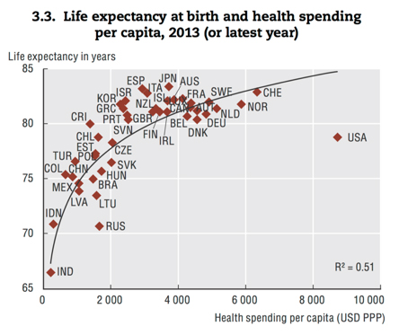
This chart is courtesy of the Organization of Economic Cooperation and Development, the well-known intergovernmental organization consisting of 35 developed nations committed to democracy and market economics. The chart, like our hypothetical flute chart, shows spending versus outcome. But in this case, the numbers are quite real, as are the outcomes.
Here we see per capita spending on health care versus life expectancy. The abbreviations are for the various OECD nations. As with the flute diagram, the best place to be is above the regression line. Also, since health care, like all other goods and services, comes with diminishing returns, we not only want to be above the line, but also back somewhere before the diminishing returns become too apparent.
For example, Korea (KOR), Israel (ISR), Greece (GRC), and others are in that “sweet spot” of the curve. Now note the USA. We are way out on the spending path. We spend far more than any other nation on health care. Yet our life expectancy (the ultimate outcome of health care) falls below most of our peers. In fact, we are about as far below the trend line as Russia!
For those who have come to think of the U.S. health-care system as the best in the world, it may be time to confront reality. In nearly every aspect of health care, we pay more to get less. We have much to learn from our foreign friends.
The morals of this story are clear. First, if your children want to play in the band, keep them away from flutes. World-class saxophones and clarinets cost many times less than flutes. Second, if you want world-class affordable health care, move to almost any other country.
Next week we will examine some other aspects of the health-care systems of the world.


