The largest river on the Indonesian island of Java begins its long journey to the sea in the beautiful twin volcanic mountains of Wayang and Windu. As the stream moves northwest towards the city of Jakarta, its pure waters pass by hundreds of factories and facilities that use the flow as nature’s free waste-removal service. Textile manufacturers pour arsenic, mercury, heavy metals, and other contaminants into the river. By the time it empties into the Java Sea, the Citarum River has been transformed from life-sustaining H2O into the world’s most polluted waterway.
I often think of this image when I consider the flow of information we receive each day regarding our economy. The brook begins with original-source data provided by agencies such as the Bureau of Labor Statistics, the U.S. Census Bureau, the Bureau of Economic Analysis, the International Monetary Fund, the World Bank, and nongovernmental institutions, including Gallup, the Pew Research Center, and so forth. The list is large.
From these sources, economists and other social scientists generate original research papers. The papers are then read, interpreted, and reported by primary news services. At this point, the information flow is showing early signs of deterioration. The secondary news services pick these stories up from the primary news outlets and rebroadcast their own interpretations and interpolations. The last and final stage, where the story empties into the sea, occurs on talk radio and other pop media outlets.
The mass-audience broadcasters specialize in the production of opinions. Unfortunately, they also produce their very own “facts.” By the time any piece of research emanates from these final sources, the information resembles the original research just as the Citarum delta approximates pure H2O.
As an example, consider a story that appeared a couple of years ago in The Maine Wire and continues to pop up on social media. The headline of the article was “Wall Street Journal: Maine Has Seen Big Turnaround in its Economy Under LePage.” The article went on to quote bits and pieces of a Wall Street Journal article which, in turn, quoted bits and pieces of an annual research report issued by Phoenix Marketing International.
Rhinebeck, N.Y.-based Phoenix Marketing International specializes in market research for the investment management industry. One of its chief products is an estimate of the amount of household investible funds across the world. American states are ranked according to the percentage of households which have at least one million dollars of investible savings.
Typically, Maryland, New Jersey, Hawaii, Connecticut, and Massachusetts rank as the top five nationally. They move around a bit from year to year as to which is first, second, and so forth. But these are the states that house the largest percentage of millionaire investors.
According to the Wall Street Journal article, Maine jumped from the 36th position to the 25th position between 2008 to 2013. That was the entire evidence behind the glowing report of our beautiful state’s economic “miracle.”
As it turns out, the jump actually took place between 2012 and 2013. In the 2015 report, Maine is back down to 29th. But what does this mean? Actually, next to nothing.
In 2013, when Maine was ranked 25th, Phoenix Marketing International had estimated through its modeling that 4.69 percent of Maine households were millionaires. This number was derived using various sources of data, estimates of business activities, and a model of equations. It was the best guess, subject to a degree of statistical error. Montana was ranked 40th, with an estimated 4.30 percent of its households in possession of a million investible bucks. In short, the difference between the 40th and 25th state was a mere 0.39 percent of households.
Unsurprisingly, a glance through prior years shows a great deal of random movement within the rankings of those states in the center of the bell curve (20th to 35th). But the spin-specialists made quite a story out of random movement. When the water flows past the factories, it ceases to be pure and simple H2O.
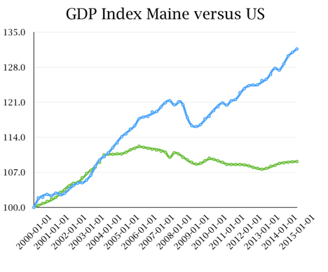
I would suggest that the single best starting point to understand the Maine economy is by examining Gross Domestic Product, our state’s economic output. In the chart below, the upper line is the total U.S. GDP index and the lower line is Maine. Note that Maine has stagnated for more than a decade. We have not participated in the rising output before the Great Recession nor in the recovery enjoyed by the rest of the nation.
Next week, we shall examine this more closely and try to understand why.


